Re: BalanceArt
I just saw the finished product, I liked everything except the head. It's a bit weequay ish.
If you can change it to look human, time being an issue I guess I can just live with it.
(BFFC Moderator)
The BFFC boards will be changing soon. Take a look at the brand-new pages and start using the new version now. You can also contact us with any feedback or requests.
Message Boards - Boba Fett Fan Club → Creative → BalanceArt
I just saw the finished product, I liked everything except the head. It's a bit weequay ish.
If you can change it to look human, time being an issue I guess I can just live with it.
Bah...time is of little importance.
Hope you like this better, sorry I didn't use the Imperial logo much, but there's a long and complicated reason why I didn't. O_o

Even if it's just shading I like the second print better. Yea, I can imagine the logo just being a pain anyway.
It is...that, and I drew his arm outstretched to make the composition more interesting, but I couldn't think of anything to put in that hand since the other one had a repeater in it (which I cheated a little bit with, lol) so I realized "hey, he could be stretching his arm out to show off his Imperial tattoo, and it kinda works that way, lol. Glad you like it. I've come a long way from that cruddy drawing of Kane I did eight or so months ago. XD
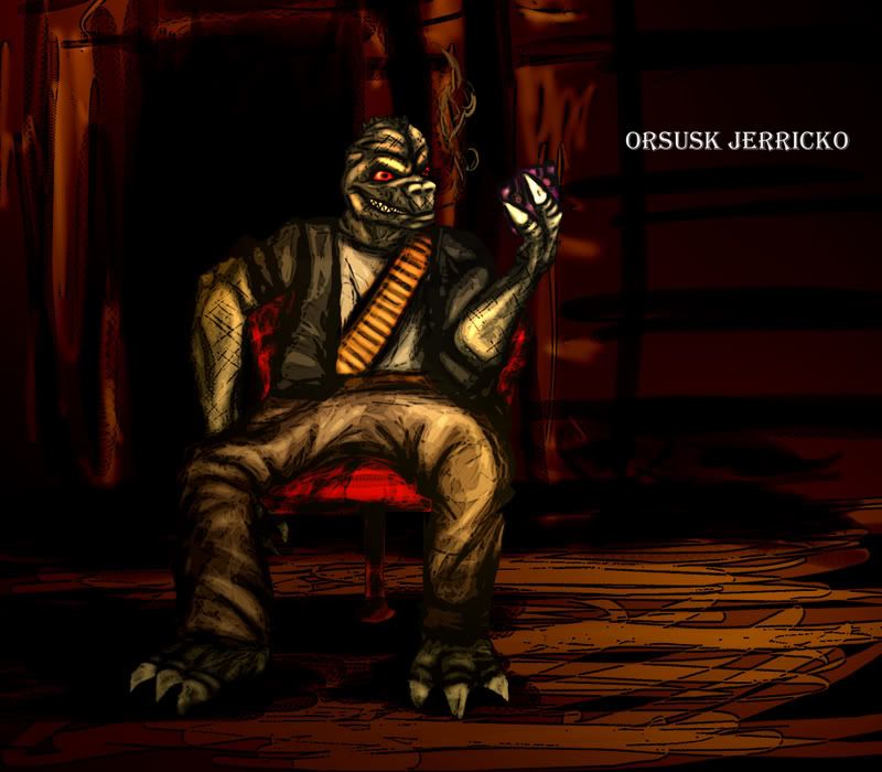
Hmmm, as for the Trandoshan sheriff...
As we discussed previously, gray scales. Dark red eyes and a very sharp toothed grin. One line of rigid spikes starting above the middle of the forehead to the back of the neck. Laid back rather than uniform or professional. Black ribbed jacket with gold or yellow trim. Most likely holstered DL-44 on the side or back of the waist. Anything you can't do is fine, just responding to the request for more in depth descrition.
Te gusta?

Amazing, simply amazing. Captures his persona very very well. The smile is my favorite part.
Wow, nice. Very nice.
(I didn't do that picture I posted, I found it on Wookieepedia under Morlish Veed. I simply meant that he looks almost exactly like him.)
Thanks all. ![]() Glad it came out pretty well. Trandos can be tricky, but the pose worked great.
Glad it came out pretty well. Trandos can be tricky, but the pose worked great.
@Revan
Oh, okay. Sorry about that then, I'll get on it as soon as you give me a detailed description of what you want. (If I have time today between homework and church, should have it done tonight.)
Awsome. ![]()
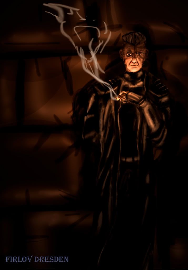
Let's see...I really like the the face on that pic I posted, so let's go with that. And he has short grey spiked hair, and wears a black Imperial uniform (no hat), a black trenchcoat that is about lower-calf length, black gloves, Imperial officer boots, and the sawed-off double-barrel...yeah...and maybe a smoking cigar in his fingers.
Thanks BalanceSheet, it's very nice of you to do all this.
You're welcome. ![]() I'm aspiring to be a conceptual artist, so I need to get used to drawing what other people want me to do, and try and make it look as good as possible. So it's no real problem for me. If you see anything about it that you dislike, or feel that I should have done differently, don't hesitate to say so; I need to get used to fixing mistakes, lol.
I'm aspiring to be a conceptual artist, so I need to get used to drawing what other people want me to do, and try and make it look as good as possible. So it's no real problem for me. If you see anything about it that you dislike, or feel that I should have done differently, don't hesitate to say so; I need to get used to fixing mistakes, lol.
Should have it done midnightish (west coast time), if I get all my homework done first.
Edit: Make that tommorow night...I've got an art portfolio to slap together and some stuff to repaint/redraw before tommorow morning. ![]()
Thanks all.
Glad it came out pretty well. Trandos can be tricky, but the pose worked great.
i agree drawing a trando is a real pain...their face is the cross between a dog and a lizard.
the color saturation really makes ur art pop off the page- nice.
WOW, BalanceSheet. That is ALL I can say. You are amazing! Kandosii, ner vod, kandosii!!
Thanks RC, cujo. ![]() If you ever want anything conceptualized (ie, you want me to draw some character/whatever for you), just give me a description and let me go with it. ^_^
If you ever want anything conceptualized (ie, you want me to draw some character/whatever for you), just give me a description and let me go with it. ^_^
@Revan: Sorry this is taking so long, but I've got a lot of crud on my plate till tommorow, lol. Might be able to get it done tonight, no promises though. I haven't forgotten about you. ![]()
This one came out pretty sloppy, I'm afraid...made some pretty big mistakes along the way, but oh well. That's how we learn...anyways.

Hmm...the wrist looks a little weird...and let's change out the cigar for the smoking shotgun...make the face lines and hair more like this:
http://s142.photobucket.com/albums/r107 … 0002-1.jpg
And...maybe...possibly...do the same chair and background as Orsusk?
(That's my first face drawing...so it's not the best...and it took me 2 1/2 hours to do it.)
K, I'll get on it....blargh, it took me 2 1/2 hours to do that, and it sucked, lol....need more practice Photoshopping humans, and I've got to start incorporating lines back into my pieces.... hmmm....I'm on it, nothing much better to do today. ^_^ Going to try and use regular lighting this time, trying to make that cigar the lightpoint was hell. : /
Hey just look back at the awesome job you did not Orsusk and think to yourself, "If I can do that, I rock out loud." Then you can go back to fixing up Firlov.
I agree that a concept artist would be an awesome occupation. By the way, I like the killer-rabbit picture a lot. I could never do anything close to that online.
I didn't mean it was bad in any way, I just said that's not what I had in mind for my character. There is also no way I could do photoshop like you can. You do rock.
(Am I looking at this correctly? I am confused.)
I didn't mean it was bad in any way, I just said that's not what I had in mind for my character. There is also no way I could do photoshop like you can. You do rock.
(Am I looking at this correctly? I am confused.)
No, don't worry Revan I'm pretty sure Balance actually appreciates the critisism as he stated it in one of his previous posts. I was just giving a rallying cheer for him as I am still amazed at how great Orsusk came out =P.
^_^ I go for a four-hour walk and all this when I get back, lol.
As Fetter said, yes, whatever criticism you have, feel free to give. I need to improve as much as possible, and the only way I can is by learning from mistakes. ![]() My mistake with Firlov was mostly twofold....I screwed up the resolution somehow and I was working with much, much fewer pixels, and I still don't know how to Photoshop good eyes. ^_^
My mistake with Firlov was mostly twofold....I screwed up the resolution somehow and I was working with much, much fewer pixels, and I still don't know how to Photoshop good eyes. ^_^
I didn't mean it was bad in any way, I just said that's not what I had in mind for my character. There is also no way I could do photoshop like you can. You do rock.
(Am I looking at this correctly? I am confused.)
Heheh, it's alright. I've only drawn two things that I ever thought were really good; Orsusk and a picture of my grandmother that my art teacher made me chop up. ![]() So I'm pretty critical of myself, and I did make some big mistakes while working on Firlov, so I'm happy to do it again.
So I'm pretty critical of myself, and I did make some big mistakes while working on Firlov, so I'm happy to do it again.
Thanks for the compliments everyone. ![]() Much appreciated, though you should realize that I'm working with a tablet and a few years of Photoshop experience, so it wouldn't be too difficult for any of you to try some of this eventually.
Much appreciated, though you should realize that I'm working with a tablet and a few years of Photoshop experience, so it wouldn't be too difficult for any of you to try some of this eventually.
@Revan: This one's going to take a while, so I can't guarantee anything soon (between homework and other obligations), but if you want to make things a little easier for me, a really quick rough sketch of the pose/position you want him in would help me out quite a bit. I know concept artists are usually supposed to just go with whatever they think up, but I'm a little hard pressed to figure out what exactly you're going for here. ^_^ Thanks.
Very nice!
Message Boards - Boba Fett Fan Club → Creative → BalanceArt
Generated in 0.115 seconds (97% PHP - 3% DB) with 10 queries
17,052 BFFC members
93,470 board posts
3,932 board topics
2,399 customized avatars
10,833,146 profile views
1,254 profile follows
